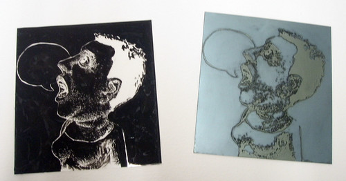
I attended the Southern Graphics Council International Conference in New Orleans last week, and my oh my, was it wonderful. The conference portfolios were pretty amazing, and I got to meet Katherine Polk, whose work I have long admired.
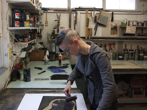
I made a special print to trade with other people for their artwork, and because I am insane, I printed an edition of 500 with four colors. I am in some ways trying to prepare myself for the book cover I'm working on right now. The book cover I will be printing in an edition of 750, but thankfully only two colors.
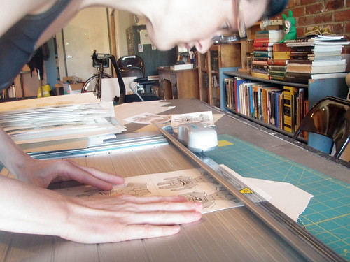
I made great use of the paper cutter I was gifted awhile ago.
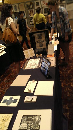
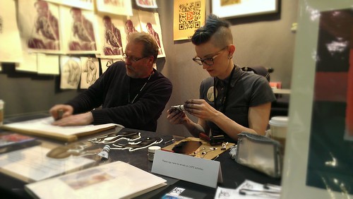
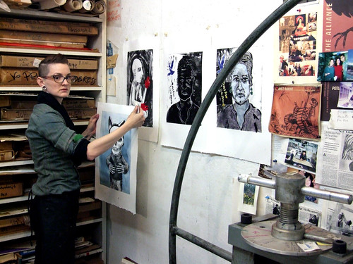
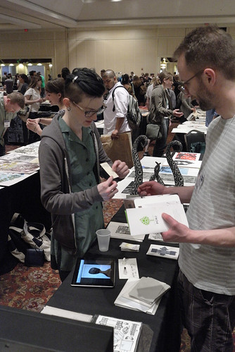
Here's my table at the SGCI New Orleans conference. I traded this print for a few awesome prints by other people, and I gave some away, too. New Orleans was gorgeous and amazing and I wished that I could have stayed longer.

This was my second trip to NOLA. The first time I went was actually ten years ago, also to attend SGCI. I pretty much only ever travel for work, and I wonder if I should try actually going on a real vacation sometime.
Tuesday, March 27, 2012
Monday, March 05, 2012
Sunlight
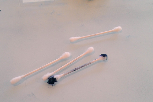
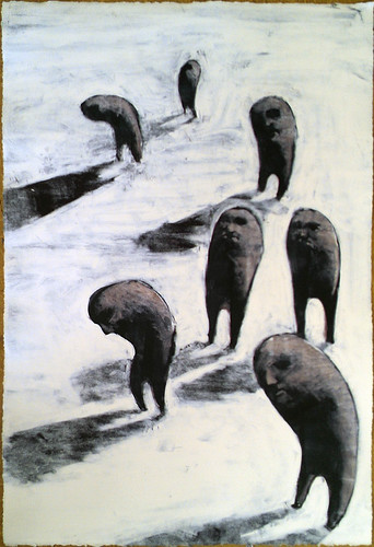
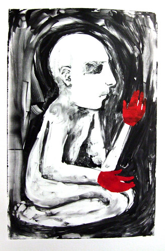
I monitored another monoprint workshop on Saturday, and since there were so few students I had a chance to pull a print of my own. A two plate monoprint--I printed the navy blue first, and then put a layer of transparent grey over the figures. I used piles of Q-tips, but maybe I need to find a tool less wasteful.
Monday, February 20, 2012
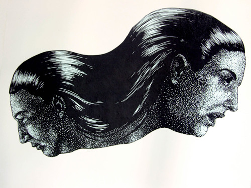
"Apart"
Last linocut of 2011.
This print is part of the Multiverse exchange at the SGCI 2012 New Orleans conference.
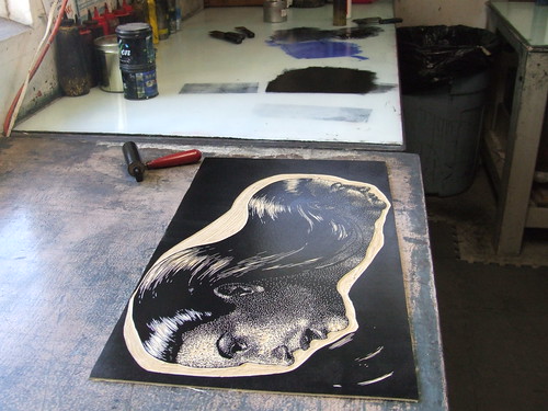
I originally intended to carve this relief print out of sintra, which is what I tend to prefer, but the deadline was closer than it should have been due to my procrastination, so I opted for linoleum, which is faster and easier to carve but loses sharpness sometimes.
I'm new to hair. To be honest, my fear of drawing hair is a little unfounded and embarrassing at this point in my career, but there it is. I'm trying to force myself to include more hair in my pieces now, just to get over it. Straight hair I think I have down pretty well now, but I don't know about curly hair.
This linocut is printed on a blue hemp washi, purchased from Hiromi Paper, and then chine colle-d onto Rives BFK.
This print is part of the Multiverse exchange at the SGCI 2012 New Orleans conference.
I originally intended to carve this relief print out of sintra, which is what I tend to prefer, but the deadline was closer than it should have been due to my procrastination, so I opted for linoleum, which is faster and easier to carve but loses sharpness sometimes.
I'm new to hair. To be honest, my fear of drawing hair is a little unfounded and embarrassing at this point in my career, but there it is. I'm trying to force myself to include more hair in my pieces now, just to get over it. Straight hair I think I have down pretty well now, but I don't know about curly hair.
This linocut is printed on a blue hemp washi, purchased from Hiromi Paper, and then chine colle-d onto Rives BFK.
Tuesday, February 14, 2012
LA Art Show, 2012
This is going to be my most name dropping blog post ever.
I printed up a mess of prints at the LA Art Show as part of the Los Angeles Printmaking Society. The IFPDA sponsored us to come and demonstrate printmaking to the audience of collectors and looky-loos at the Art Show. It was lots of fun, and I was lucky enough to find a purchaser for two of my large sculptural prints. And that means they take up less space in my loft and I can make more sculptures soon.
At the premiere party, I met Kim Coates (who plays Tig, the sergeant of arms) from Sons of Anarchy. He and his wife were completely charming in a way that I found surprising because I'm still such a naif that I expect actors to be somewhat like the characters they play.
David Caruso listened to my spiel and watched me print for a bit, but I didn't know what to say to him because I only know CSI: Miami from watching the Soup and when they'd film on my old campus.
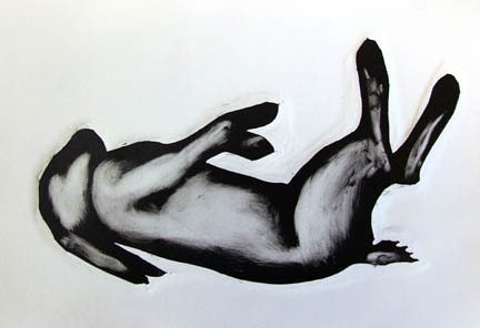
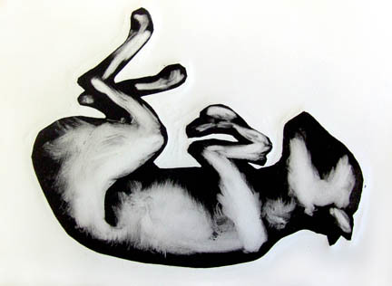
Here are the three prints I made especially for the LA Art Show.
They are relief monoprints: I carved a relief silhouette, and then selectively inked it. I'm really happy with how they came out and am now printing the three plates together on a full size sheet of BFK.
I printed up a mess of prints at the LA Art Show as part of the Los Angeles Printmaking Society. The IFPDA sponsored us to come and demonstrate printmaking to the audience of collectors and looky-loos at the Art Show. It was lots of fun, and I was lucky enough to find a purchaser for two of my large sculptural prints. And that means they take up less space in my loft and I can make more sculptures soon.
![]() |
| Jason and I at the premiere party |
David Caruso listened to my spiel and watched me print for a bit, but I didn't know what to say to him because I only know CSI: Miami from watching the Soup and when they'd film on my old campus.
![]() |
| Printmaker David Lefner, Shyla, and myself at the premiere party |
| Showing the heavy embossment to some onlookers |
| Plates to print |
![]() | |||
|
| Printing with the artist Dirk Hagner |
Here are the three prints I made especially for the LA Art Show.
They are relief monoprints: I carved a relief silhouette, and then selectively inked it. I'm really happy with how they came out and am now printing the three plates together on a full size sheet of BFK.
Friday, February 03, 2012
The Catman and Woodcut Workshop
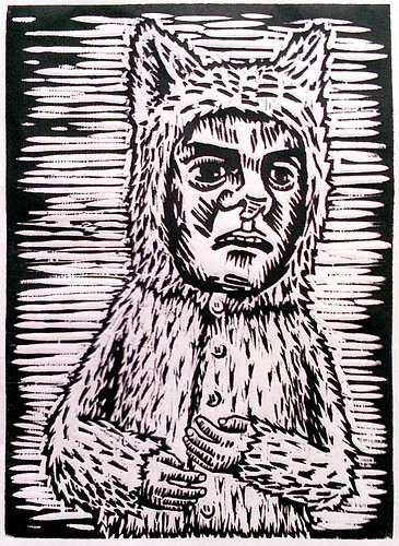
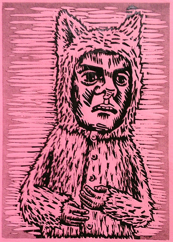
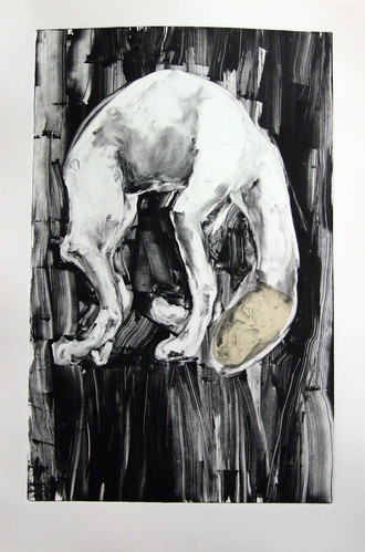
I have this character that is a my go-to for when I need to draw something quickly for a demonstration (see my Viscosity prints, for instance). I just finished up a woodcut workshop, and I had spent hours drawing out a beautiful bird carcass to use as the demo for the class and then I realized, an hour before the students were due to arrive, that I wouldn't have time to draw and carve the whole image and that using a really complex image would only freak out the students. So, the Catman. I drew the image minutes before the class started and was able to carve him inbetween helping the students. We used pine, which was horrid, but it was only fair that I made something with the same wood that they were using.
I printed him on white washi, a wretched Pepto pink paper as a kiss print (using the ghost ink as a gray, partially ink only a selected area), on fabric from the scrap bin, and with a little monotype overlay.
Friday, January 06, 2012
Uno, dos, tres
I take a light rail train from my home in the factory district to downtown, where I catch a bus to Santa Monica. Yesterday, a man walked slowly up and down the crowded train car, slowly spelling out his name: "D"..."O"..."M"..."I"..."N"..."I"..."C"...followed by counting to ten, over and over, in Spanish. As he walked, he would look people directly in the eyes before passing them. He walked to the end of the car, and slowly pivoted before walked back to the front, while counting. At first, it was the sort of funny that's pitiable--the drunk old man singing to himself. But he never stopped, he had been performing this action when I boarded and was continuing after I left. It became almost threatening.
Monday, January 02, 2012
Monday, December 26, 2011
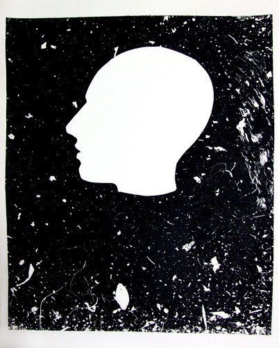
Black field with white
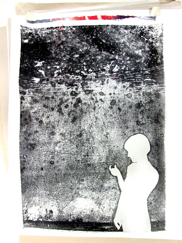
I prepped some plates for a demo on indirect drawing,or the "Paul Klee technique" as my boss calls it, but I over inked them, so they never dried to the right consistency. I put them outside for a couple of hours, hoping that the sun would speed up the drying a little but instead the wind deposited a large amount of debris on the surface of the ink. Rather than waste them, I quickly cut out a silhouette, placed it at the bottom of the plate, and ran a print from it.
I like it so much, that I salvaged one of the sheets that someone else threw away from the garbage, soaked it, and ran the ghost on it. The sheet had been crumpled and had a layer of wheatpaste one it already from the previous failed print, imparting an interesting texture to the final image.
Labels:
art,
black and white,
josephine press,
monoprint,
monotype,
printmaking,
silhouette
Friday, December 23, 2011
Thursday, December 08, 2011
Monotype workshop, session 2.5: Viscosity
The second session of the workshop I taught viscosity inking. Viscosity, mostly because I think it sort of has to be covered even if it ends up going over most people's heads. Carla, one of the students, pointed out that I use many food metaphors when I discuss technique--for viscosity, and the way the thin ink resists the stiff ink, I used the example of cocoa powder poured over water failing to mix, but mixes the other way around.
The face I draw when people watch me draw is pretty obvious and repetitive. My repertoire of things I can draw while talking and being observed is now this face, a skull, and maybe hands doing something. I need to expand.
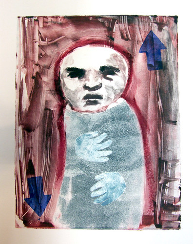
The blue shirt is the viscosity roll, and I finished theprint by added a couple of blue arrows from a potato stamp:
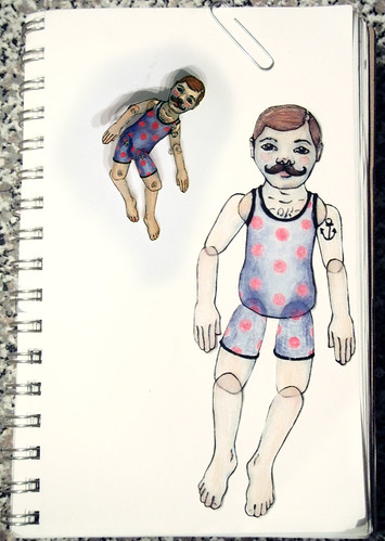
This fellow is a two plate print, with the first print utilizing viscosity inking for the light blue part of the pajamas:
And here's another version of the same image. I reworked it from the ghost of the previous print, but I changed the color so much it's not really evident.
The face I draw when people watch me draw is pretty obvious and repetitive. My repertoire of things I can draw while talking and being observed is now this face, a skull, and maybe hands doing something. I need to expand.
The blue shirt is the viscosity roll, and I finished theprint by added a couple of blue arrows from a potato stamp:
This fellow is a two plate print, with the first print utilizing viscosity inking for the light blue part of the pajamas:
And here's another version of the same image. I reworked it from the ghost of the previous print, but I changed the color so much it's not really evident.
Labels:
camilla taylor,
josephine press,
monoprint,
monotype,
printmaking
Monday, November 28, 2011
Monotype workshop, session 2: Chine Colle
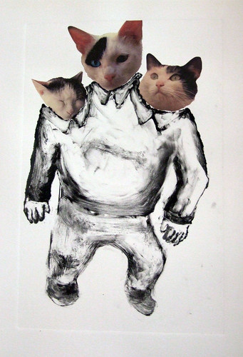
The second session of the monotype workshop at Josephine Press I taught chine colle and viscosity inking. Chine colle is always a big hit, and even though I have a tendency to use the neutrals and muted tones for my demos, students always love getting into the patterned and colorful washi papers for their own prints. Anyhow, the night before this workshop I drew two skulls on pieces of washi, one deer skull and one marmot skull. Washi is so thin that it often doesn't stand up to erasing at all, so I just let the mistakes stay in the finished drawing. I also used the Epson 2000 we have at Josephine Press to print up some photographs on to some coated washi from Hiromi paper. That way, I could show them how to make an archival print that still has the collaged look of magazine and newspaper clippings, though, to be honest, I think my cat monster didn't turn out so hot. If I have time, I'll probably add another layer to it.
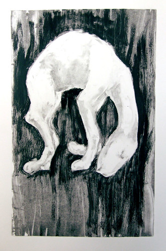
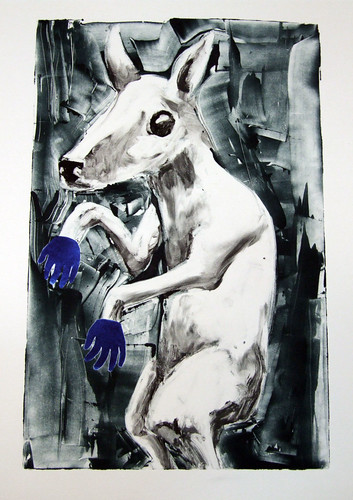
The two chine colle-ed prints with pre-drawn washi:
And here's a ghost (a ghost is when you use the ink left on the plate after printing,) printed from one of the previous images:
The Cat Monster chine colle, but I think it's unfinished:
And then lastly, I made this guy, inspired by a recent villain on Adventure Time, just to give a quick refresher on stencilling, the lesson from the first week:
The two chine colle-ed prints with pre-drawn washi:
And here's a ghost (a ghost is when you use the ink left on the plate after printing,) printed from one of the previous images:
The Cat Monster chine colle, but I think it's unfinished:
And then lastly, I made this guy, inspired by a recent villain on Adventure Time, just to give a quick refresher on stencilling, the lesson from the first week:
Labels:
art,
camilla taylor,
digital print,
josephine press,
monoprint,
monotype,
printmaking
Sunday, November 27, 2011
I went to LACMA for the only showing at the Tarkovsky retrospective that I could make it to, Andrei Rubliev. It was just as long as I had hoped it would be, and then a little bit more than that even. Behind us a girl I knew and her mother spoke in Russian. I thought of the things that they heard that I could not as we watched the movie. Their mouths were the same pouted shape of the protoganist whose invented biography disjointedly was relayed. It was violent, implied, as actors had throats slashed by Tatars, clutching tubes to their necks so that dark grey fluid would pump across their white necks and onto the equally grey mud.
Monday, November 21, 2011
Polystyrene
As part of the workshop I taught in Salt Lake last month (check the last blog entry), I researched what substrates could receive ink beyond just paper. Fabric is an obvious solution that I've explored extensively, but I also found that polystyrene plastic takes acrylic screen ink wonderfully
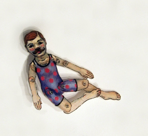
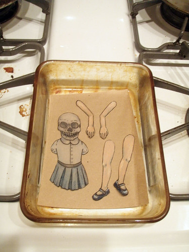
Here's the skeleton girl screenprint on polystyrene with colored pencil, cut and ready to be reduced in the oven:

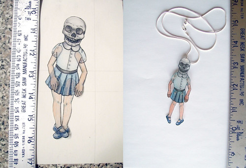
An illustration of just how much the polystyrene reduces:

One of the issues I'm coming ot understand is that the colors intensify--the individual marks are moved closer together, so the color appears more concentrated after reducing the image.
I added drilled the holes into the pieces to joint the doll after reducing using a 1/16th drill bit, and added a jump ring and silver chain:

This guy reduced a little more, maybe because I left it in longer:

I used plastic adhesive to attach a pin backing, making the little acrobat a brooch:
Here's the skeleton girl screenprint on polystyrene with colored pencil, cut and ready to be reduced in the oven:
An illustration of just how much the polystyrene reduces:
One of the issues I'm coming ot understand is that the colors intensify--the individual marks are moved closer together, so the color appears more concentrated after reducing the image.
I added drilled the holes into the pieces to joint the doll after reducing using a 1/16th drill bit, and added a jump ring and silver chain:
This guy reduced a little more, maybe because I left it in longer:
I used plastic adhesive to attach a pin backing, making the little acrobat a brooch:
Monday, November 14, 2011
Monotype workshop, session 1
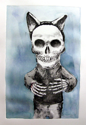
Saturday, November 12th, was the first session for the monotype workshop I'm teaching at Josephine Press. We covered basic stuff, inking and stencilling. Here are two of the three prints I made as part of the demo. The skeleton in cat ears I finished by adding a blue background with watercolor.
Labels:
camilla taylor,
josephine press,
monoprint,
monotype,
printmaking,
watercolor,
workshop
Monday, November 07, 2011
Tradigital, 1
A couple months ago, I started working at Josephine Press in Santa Monica. It's a small press that publishes a few prints, does some workshops, etc. Josephine does a lot of "tradigital" work, prints that combine digital and traditional techniques. Mostly, theses are intaglio and relief prints over digital backgrounds. The digital part is often very colorful, which is taking some getting used to for me. John Greco, the master printer at Josephine, had me make two tradigital relief prints using photopolymer plates and digital backgrounds.
Photopolymer plates are also something I've never worked with much before. Light hits the plate and hardens the polymer there, so to work with it you make a negative of the image you eventually want to print, much like photography. I painted my negative on wetwork acetate using cel medium, but you can also just invert an image in Photoshop and print it out on a transparency if you don't like having to think backwards.
The relief printed image is from an artjam I did with my pal Trent Call, and the digital bit is a photograph I took of downtown LA. The paper is this special washi that's coated to be used in inkjet printers from Hiromi Paper.
Photopolymer plates are also something I've never worked with much before. Light hits the plate and hardens the polymer there, so to work with it you make a negative of the image you eventually want to print, much like photography. I painted my negative on wetwork acetate using cel medium, but you can also just invert an image in Photoshop and print it out on a transparency if you don't like having to think backwards.
The relief printed image is from an artjam I did with my pal Trent Call, and the digital bit is a photograph I took of downtown LA. The paper is this special washi that's coated to be used in inkjet printers from Hiromi Paper.
Labels:
digital print,
josephine press,
printmaking,
relief print
Wednesday, November 02, 2011
Person | Place | Thing
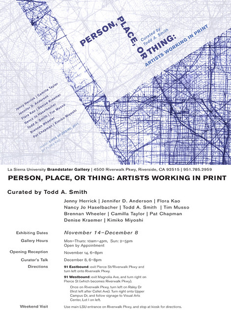
I have two sculptural pieces and two flat pieces in "Person, Place or Thing" curated by Todd Smith, Brandstater Gallery, La Sierra University, Riverside, CA. Opening reception is November 14th, 2011, 6-8pm.
Subscribe to:
Posts (Atom)