Showing posts with label josephine press. Show all posts

Wednesday, September 05, 2012

Monoprint Workshop


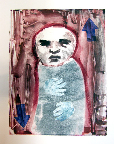
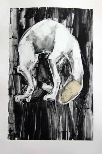
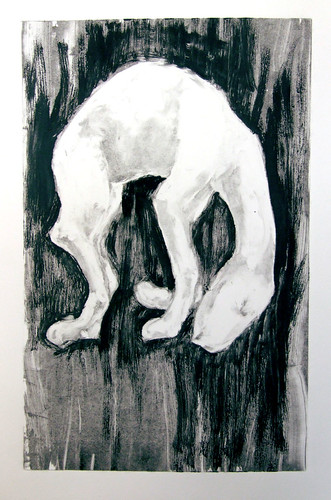
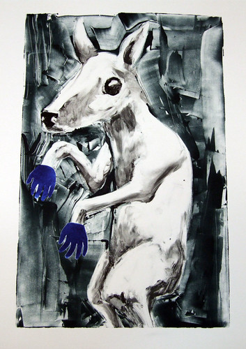
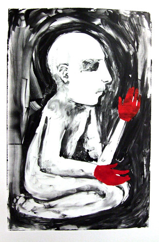
I run a monoprint printing session at Josephine Press, and last weekend I had a  couple of new people, so I got to do some mini demos of the basic techniques.  To the left, the first image is demonstration reductive inking for the figure, additive inking for the blue background, and stencils for the halo.  Next to it is the ghost print.  A ghost print is a print when only the residue left on the plate is printed. It always takes artists used to working painting on canvas and panel awhile to get accustomed to painting on plexiglass for monoprint, but at this point in my career, I'm far more adept at using the plexiglass.

I'm trying to get people to work more with multiple plate printing, so the second print I demonstrated I made sure to use two plate.  The green background and the figures body were printed first, followed by the hands and face for the second print.

Last picture are the stencils I cut. 


Monday, July 23, 2012

Collagraph: "Raven"


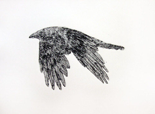
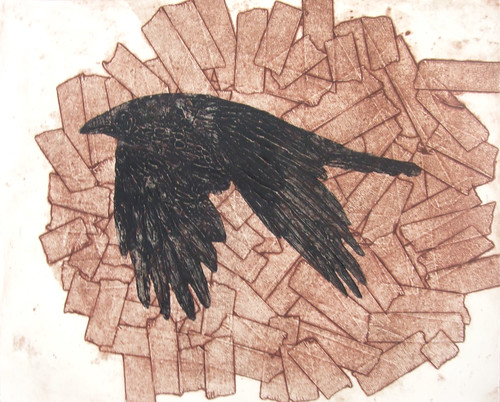
I just wrapped up a four day, four week, collagraph workshop at Josephine Press. You can see examples of some of my student's work on the JP blog, here. Collagraphs are pretty fun, especially for someone new to printmaking. The plates are made out of all manner of stuff, much of it just garbage, and all glued down to a simple, cheap substrate like chipboard. I tore the back off an old calendar for this one. After gluing all the pieces down to the substrate, the plate is sealed with a couple of layers of acrylic medium to protect it from the ink and solvents applied to it. I made two demo prints for the class. The first was a little house print, and the second was this raven collagraph. The plate is made with modeling past on a chipboard substrate. I cut the chipboard to the shape of the raven and then messed around with acrylic modeling paste to get the feathers and other features of the bird. Below are two prints, the the raven printed in conjunction with another plate, and then the ghost print of just the raven.

Monday, March 05, 2012

Sunlight


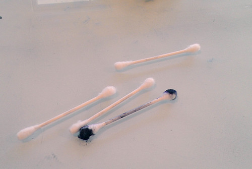
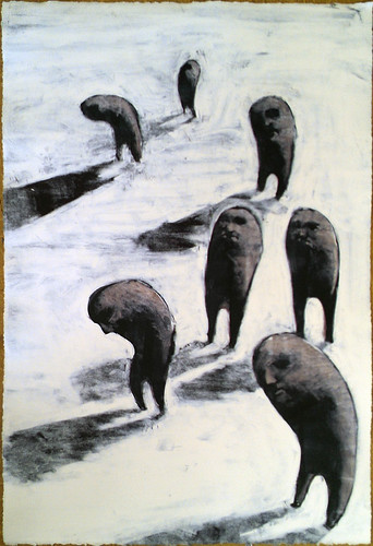
I monitored another monoprint workshop on Saturday, and since there were so few students I had a chance to pull a print of my own. A two plate monoprint--I printed the navy blue first, and then put a layer of transparent grey over the figures. I used piles of Q-tips, but maybe I need to find a tool less wasteful.

Friday, February 03, 2012

The Catman and Woodcut Workshop

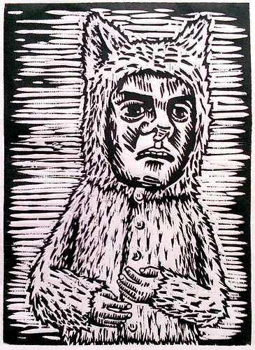
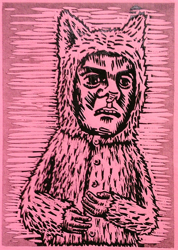
I have this character that is a my go-to for when I need to draw something quickly for a demonstration (see my Viscosity prints, for instance). I just finished up a woodcut workshop, and I had spent hours drawing out a beautiful bird carcass to use as the demo for the class and then I realized, an hour before the students were due to arrive, that I wouldn't have time to draw and carve the whole image and that using a really complex image would only freak out the students. So, the Catman. I drew the image minutes before the class started and was able to carve him inbetween helping the students. We used pine, which was horrid, but it was only fair that I made something with the same wood that they were using.

I printed him on white washi, a wretched Pepto pink paper as a kiss print (using the ghost ink as a gray, partially ink only a selected area), on fabric from the scrap bin, and with a little monotype overlay.

Monday, January 02, 2012

Black field with white, again


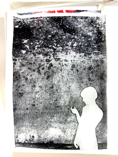
Monotype made with handcut paper stencil, and debris from the patio

Monday, December 26, 2011

Black field with white

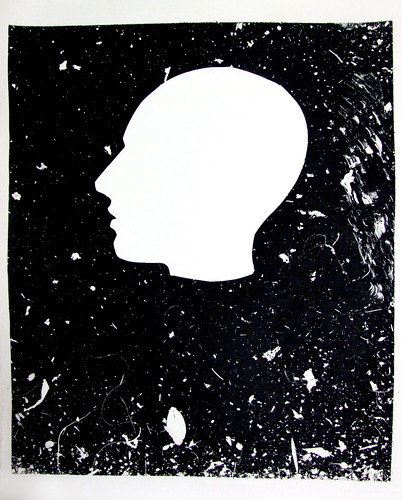
I prepped some plates for a demo on indirect drawing,or the "Paul Klee technique" as my boss calls it, but I over inked them, so they never dried to the right consistency. I put them outside for a couple of hours, hoping that the sun would speed up the drying a little but instead the wind deposited a large amount of debris on the surface of the ink. Rather than waste them, I quickly cut out a silhouette, placed it at the bottom of the plate, and ran a print from it.


I like it so much, that I salvaged one of the sheets that someone else threw away from the garbage, soaked it, and ran the ghost on it. The sheet had been crumpled and had a layer of wheatpaste one it already from the previous failed print, imparting an interesting texture to the final image.

Thursday, December 08, 2011

Monotype workshop, session 2.5: Viscosity

The second session of the workshop I taught viscosity inking. Viscosity, mostly because I think it sort of has to be covered even if it ends up going over most people's heads. Carla, one of the students, pointed out that I use many food metaphors when I discuss technique--for viscosity, and the way the thin ink resists the stiff ink, I used the example of cocoa powder poured over water failing to mix, but mixes the other way around.

The face I draw when people watch me draw is pretty obvious and repetitive. My repertoire of things I can draw while talking and being observed is now this face, a skull, and maybe hands doing something. I need to expand.

The blue shirt is the viscosity roll, and I finished theprint by added a couple of blue arrows from a potato stamp:

This fellow is a two plate print, with the first print utilizing viscosity inking for the light blue part of the pajamas:

And here's another version of the same image. I reworked it from the ghost of the previous print, but I changed the color so much it's not really evident.

Monday, November 28, 2011

Monotype workshop, session 2: Chine Colle

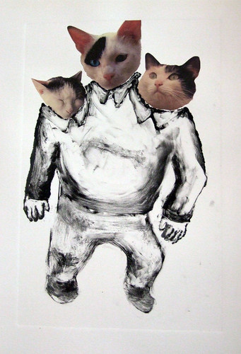
The second session of the monotype workshop at Josephine Press I taught chine colle and viscosity inking. Chine colle is always a big hit, and even though I have a tendency to use the neutrals and muted tones for my demos, students always love getting into the patterned and colorful washi papers for their own prints. Anyhow, the night before this workshop I drew two skulls on pieces of washi, one deer skull and one marmot skull. Washi is so thin that it often doesn't stand up to erasing at all, so I just let the mistakes stay in the finished drawing. I also used the Epson 2000 we have at Josephine Press to print up some photographs on to some coated washi from Hiromi paper. That way, I could show them how to make an archival print that still has the collaged look of magazine and newspaper clippings, though, to be honest, I think my cat monster didn't turn out so hot. If I have time, I'll probably add another layer to it.

The two chine colle-ed prints with pre-drawn washi:


And here's a ghost (a ghost is when you use the ink left on the plate after printing,) printed from one of the previous images:


The Cat Monster chine colle, but I think it's unfinished:


And then lastly, I made this guy, inspired by a recent villain on Adventure Time, just to give a quick refresher on stencilling, the lesson from the first week:

Monday, November 14, 2011

Monotype workshop, session 1


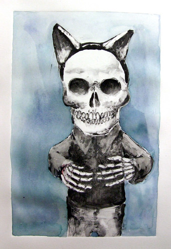
Saturday, November 12th, was the first session for the monotype workshop I'm teaching at Josephine Press. We covered basic stuff, inking and stencilling. Here are two of the three prints I made as part of the demo. The skeleton in cat ears I finished by adding a blue background with watercolor.


Monday, November 07, 2011

Tradigital, 1

A couple months ago, I started working at Josephine Press in Santa Monica. It's a small press that publishes a few prints, does some workshops, etc. Josephine does a lot of "tradigital" work, prints that combine digital and traditional techniques. Mostly, theses are intaglio and relief prints over digital backgrounds. The digital part is often very colorful, which is taking some getting used to for me. John Greco, the master printer at Josephine, had me make two tradigital relief prints using photopolymer plates and digital backgrounds.


Photopolymer plates are also something I've never worked with much before. Light hits the plate and hardens the polymer there, so to work with it you make a negative of the image you eventually want to print, much like photography. I painted my negative on wetwork acetate using cel medium, but you can also just invert an image in Photoshop and print it out on a transparency if you don't like having to think backwards.


The relief printed image is from an artjam I did with my pal Trent Call, and the digital bit is a photograph I took of downtown LA. The paper is this special washi that's coated to be used in inkjet printers from Hiromi Paper.