
Sunday, September 26, 2010


Sunday, September 19, 2010
Redemption
Last week while the students were busily working on their monotypes, Brian and I sporadically painted on a large plexi inbetween helping the students. At the end of the day, we tried to print it but by then the ink had just totally dried out and was so sticky it tore the paper instead of transferring. Brian said we should just throw it away, but I had just that very morning told the students to hang on to their crappy old prints so they could rework them later on. I couldn't just throw it away now!
The paper was so torn that I needed to layer washi all over it to maintain any structural integrity. The paper was originally BFK cream, and I chine colle-ed two large sheets of white kitti katta over top when I printed the image, done in black and Payne's grey. The image is from a drawing of people falling through space done while flying back from NYC to LA. I must be a wonderful seat mate for long flights.


The paper was so torn that I needed to layer washi all over it to maintain any structural integrity. The paper was originally BFK cream, and I chine colle-ed two large sheets of white kitti katta over top when I printed the image, done in black and Payne's grey. The image is from a drawing of people falling through space done while flying back from NYC to LA. I must be a wonderful seat mate for long flights.
Saturday, September 11, 2010


Friday, September 03, 2010
First day of class
Today I had my first day of being an actual real live teacher. Brian Borlaug and I are teaching the print survey class at CSULB this semester, and the first assignment we gave was monotype. I took lead on this one because I'm a bit more adept at it.
This first print for the demo is reductive mark making. This one is done with just graphite ink, using Q-tips as brushes. We have some of these amazing Japanese q-tips in the shop, and I try to use them sparingly so they don't run out too fast.

This first print for the demo is reductive mark making. This one is done with just graphite ink, using Q-tips as brushes. We have some of these amazing Japanese q-tips in the shop, and I try to use them sparingly so they don't run out too fast.
Friday, August 27, 2010
Small People

In the past couple of months I've been really getting into making jewelry and wearables. It's sort of a waste of time right now, as I should be devoting more of my efforts into my thesis project and not into things that don't relate to my thesis. Well, at least I'll be brilliantly accessorized when that final show rolls around in the spring.
I made these in an "edition" of 100. The quotation marks are because the doll brooches aren't prints, though the faces are made partially with a mold, so editioning them is a little different. Each doll comes packaged in a frame tin with a unique mixed technique print in the back.
Monday, August 23, 2010


Wednesday, August 11, 2010
Unwitting Collaborator, part 2
Three more in the Unwitting Collaborator series in which I use discarded prints and drawings as the base for an image. Two of these have chine colle-ed tea bags. The letterpress pieces are from the University of Utah's letterpress studio trashbin, and then carted all the way back to Long Beach, CA, so they're doubly scrounged from the trash: the first time as discarded prints, and then revitalized with discarded type.
Letterpress, monoprint, screenprint:

Relief print, monoprint, chine colle, letterpress:

Etching, letterpress, monoprint, chine colle:

Letterpress, monoprint, screenprint:
Relief print, monoprint, chine colle, letterpress:
Etching, letterpress, monoprint, chine colle:
Wednesday, August 04, 2010
Bleach Screenprinting
This is a screenprint using bleach suspended in a clear matrix instead of ink on found black paper. Though it's somewhat toxic (wear a gas mask and work in a ventilated area) bleach prints are so much fun to make. Even though you know damn well what the screenprint will look like, there's a magic to pulling the print and watching the image develop from black to the bleached out golds and browns, and sometimes even blues (for some reason, black velvet often bleaches out to blue). This print is actually about a year old, but I'm going to be trying some new bleach prints this August.

Wednesday, July 28, 2010
HNCB IV
This is fourth in the suite "He Never Came Back," and it's for sale at Twentieth Gallery along with the first and second from the suite (the third and fifth I'm hanging onto for my thesis show in the Spring).
It's a remix of old relief prints, rearranged and sewn into new patterns and on a new form along with lots of scrap from the process of making other pieces. It stands about four feet high

And here's an unedited image of the front view:

It's a remix of old relief prints, rearranged and sewn into new patterns and on a new form along with lots of scrap from the process of making other pieces. It stands about four feet high
And here's an unedited image of the front view:
Wednesday, July 21, 2010
"Head"

"Head" Blind embossing on paper, paper construction

Blind embossing is incredibly difficult to photograph, I've found. This piece is another in the ON|PAPER show. It's in an edition of 100, and I made it intentionally easy for people to construct themselves, but I don't know if anyone who has purchased one has actually tried it yet or not.

All of the papercraft pieces I've made heretofore have been very complicated. The little man with a ghost in his chest takes me about an hour to construct, and I'm the person who designed it so I can't imagine how long it takes the people who bought one, or if they even try, for that matter. The other concern was how I didn't think I've brought anything very new to the medium so far. What is it that I can do that all of the other artists can't or haven't? A black and white illustration is pretty common.
With this in mind, I designed two new papercrafts that are very simple to construct but a little bit more complicated and innovative on my side. They're blind embossed, so all of the detailed on the surface is actually 3D instead of a flat drawing. To make this one, I carved out the features in reverse--making a mold. It takes some getting used to thinking this way, but since much of printmaking requires a constant awareness of reversal, I got the hang of it pretty soon.
Thursday, July 15, 2010
Ghost

Like the self contained little ball person, the ghost was also motivated by a desire to broaden my papercrafting and to make something very easy to assemble. It stands just a hair above 3 inches.
It has a very light monoserigraph layer with graphite, and then blind embossed with a sintra engraving.
This piece is part of the show I'm in at Billis Gallery in Culver City, ON|PAPER.


Tuesday, July 13, 2010
Many things
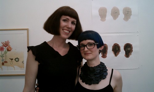
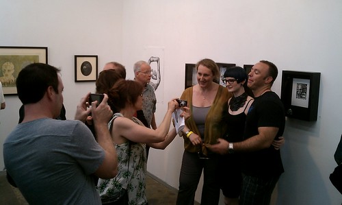
ON|PAPER opened. I calculatedly made and wore an elaborate necklace as I figure it's always good to stand out at a reception and give people a reason to talk to you. It's sort of a financially motivated form of "peacocking."
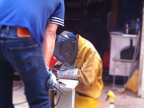
David taught me how to spot weld with a MIG set up, and while I am not very good at it yet I'm good enough for my purely structural purposes.
I have new pieces up at Twentieth Gallery, in the front window, in one of the back rooms, and a little doll brooch that's probably at the sales people's desk.


David taught me how to spot weld with a MIG set up, and while I am not very good at it yet I'm good enough for my purely structural purposes.
I have new pieces up at Twentieth Gallery, in the front window, in one of the back rooms, and a little doll brooch that's probably at the sales people's desk.
Wednesday, July 07, 2010
HNCB III
This is the third in a series of five prints, entitled "He Never Came Back, III." It's made from printed scraps--the bits of the print I cut off when sewing together other work. I saved all of the black pieces, sewed them together, and then added bits of white buttons.

Here's one and two:

Here's one and two:
Wednesday, June 30, 2010
Castle

Dreams of finding new unexplored places in familiar houses are like the locked chamber in Bluebeard's castle: the empty unoccupied places never offer actual habitability.


Unwitting Collaborator
It gives me great pains to throw something away that is still useful. This proclivity to hold onto things is constantly on the verge of A&E Hoarder territory that I rationalize away as my inclinations are towards usefulness, not sentimentality. This is willful self deception.
In the printshop, people discard old prints, old paper, and test proofs. I collect these, and layer over them each time I print something else. I print multiple times on a found piece until it's become something new, unrecognizeable to the original artist, and perhaps better, perhaps not. I have a drawer full of these in progress, but here are a few that I deemed "finished." Mediums include lithography, screenprint, monoserigraphy, letterpress, etching, relief, monotype, and hand drawing.


In the printshop, people discard old prints, old paper, and test proofs. I collect these, and layer over them each time I print something else. I print multiple times on a found piece until it's become something new, unrecognizeable to the original artist, and perhaps better, perhaps not. I have a drawer full of these in progress, but here are a few that I deemed "finished." Mediums include lithography, screenprint, monoserigraphy, letterpress, etching, relief, monotype, and hand drawing.
Thursday, June 17, 2010
B-sides
screenprints in moleskine sketchbook:


The term "b-sides" in referrence to art process ephemera is shameless cribbed from Cein Watson.
The term "b-sides" in referrence to art process ephemera is shameless cribbed from Cein Watson.
Wednesday, June 02, 2010
Commercial applications thereof
Today I made a two color screenprint as the packaging for some barrattes. Medusa, a mermaid, and a man with just one big curl were the three motifs for the cards. I used discarded prints collected throughout the semester from other students and printed on the backside, then mounted them onto another sheet of paper before cutting them down--making a cardstock that, while laborious, has the added benefit of being for free.


I made a grid of six of the cards, two of each design, and burned it on the screen. But I was distracted while spraying out the screen after the initial exposure and ruined the second mermaid. I kind of liked the look, though, so I used screenfill to block out the text and outlined the mermaid's body, making this:

I'm going to use those as postcards and finally send some snail mail to my many long distance friends.
I made a grid of six of the cards, two of each design, and burned it on the screen. But I was distracted while spraying out the screen after the initial exposure and ruined the second mermaid. I kind of liked the look, though, so I used screenfill to block out the text and outlined the mermaid's body, making this:
I'm going to use those as postcards and finally send some snail mail to my many long distance friends.
Tuesday, May 25, 2010
Subscribe to:
Posts (Atom)

